UI
Two layers, both script-facing.
| Layer | What it is | For |
|---|---|---|
widget | A component on a scene node. Retained: saved with the scene, edited in the inspector, previewed in the viewport | A game HUD, a settings screen, a whole tool |
the ui module | Immediate-mode egui, redrawn every frame from a script's draw_ui | A canvas that paints itself: a timeline, a weight table |
The editor's shell, docks, inspector and tab rows are widget nodes in
editor/scenes/main.toml. Its four painting views use the ui module.
Widgets: game HUDs as scene nodes
[[nodes]]
name = "Score"

[nodes.widget]
kind = "label"
text = "Score 0"
anchor = "top_left"
x = 20
y = 16
font_size = 22
text_color = "#2b2b2b"
- One
widgetcomponent.kindsays what it draws:label,buttonorpanel. Every component with variants selects one withkind. - Widgets are scene nodes: saved with the scene, edited in the editor, updated through the component handle.
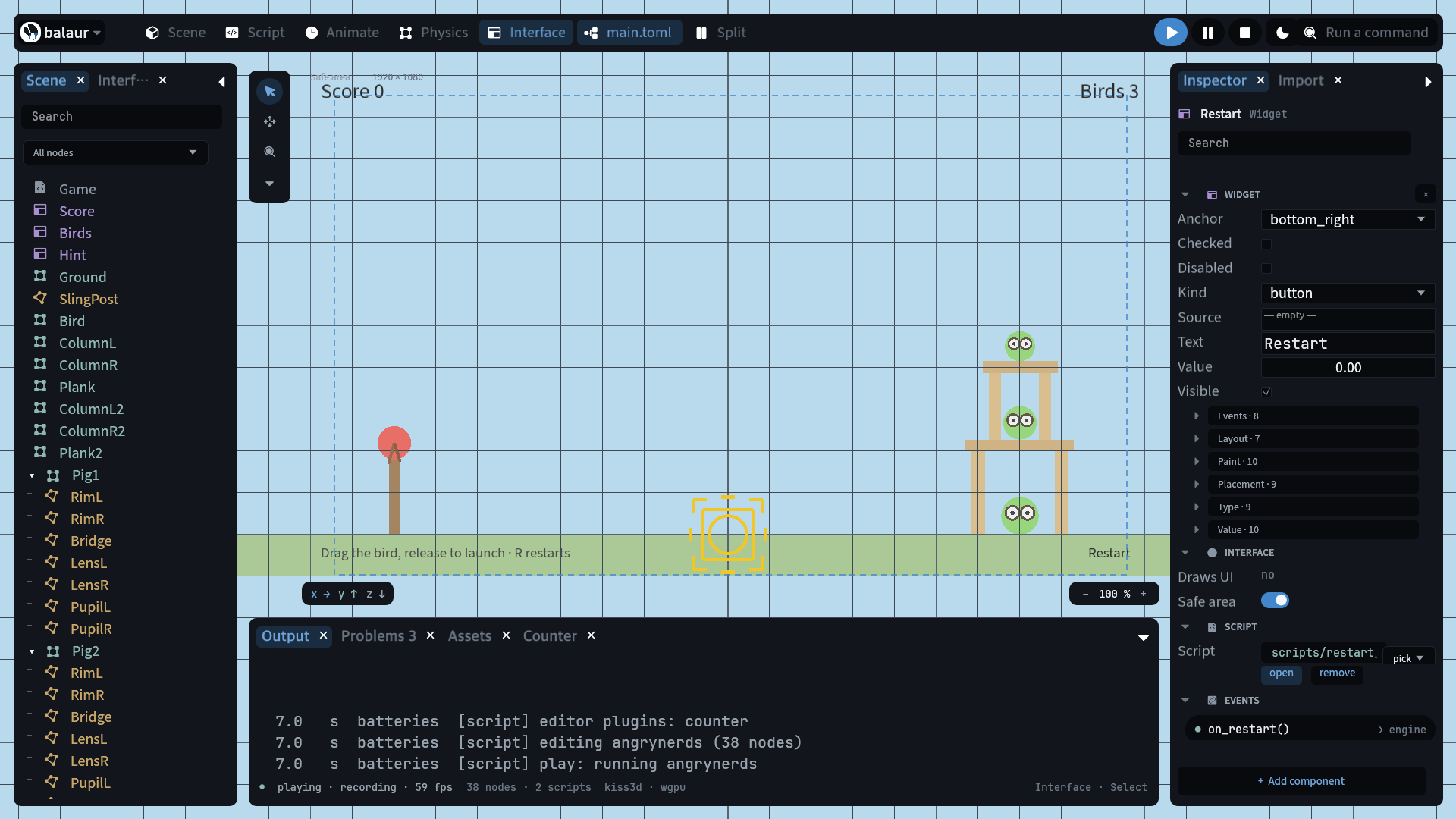
A button acts in one of two ways:
[nodes.widget]
kind = "button"
text = "Start"
on_click = "start_pressed"
pub fn start_pressed(this) {
    log::info("start");
}

// or, without on_click:
pub fn update(this, dt) {
    if this.node.widget.get().clicked {
        log::info("start");
    }
}
// scripts/restart_button.rn, on the Restart node
pub fn on_restart(this) {
    this.node.get_node("../Game").call("restart");
}
on_clicknames a method on the node's own script. A button acting on another node forwards the call.clickedis read-only and true for the frame of the press.
let w = this.node.widget.get();
w.text = "Score 10";
this.node.widget.set(w);
- A handle's
setbuilds the component from the given table over the schema's defaults. To change one property,getfirst. - Panels size to their content when
widthorheightis 0. visiblehides a widget and keeps its state.ui::set_widget_layerscopes and toggles the layer.
The kinds
| Group | Kinds |
|---|---|
| Text | label, text_field, text_area, code |
| Controls | button, checkbox, switch, dropdown, slider, number_field, color_picker, progress_bar, menu |
| Data | list, tree, table |
| Boxes | panel, row, column, grid, flow, scroll, tabs, fold, dialog, toast, window, stack |
| Other | image, separator, draw |
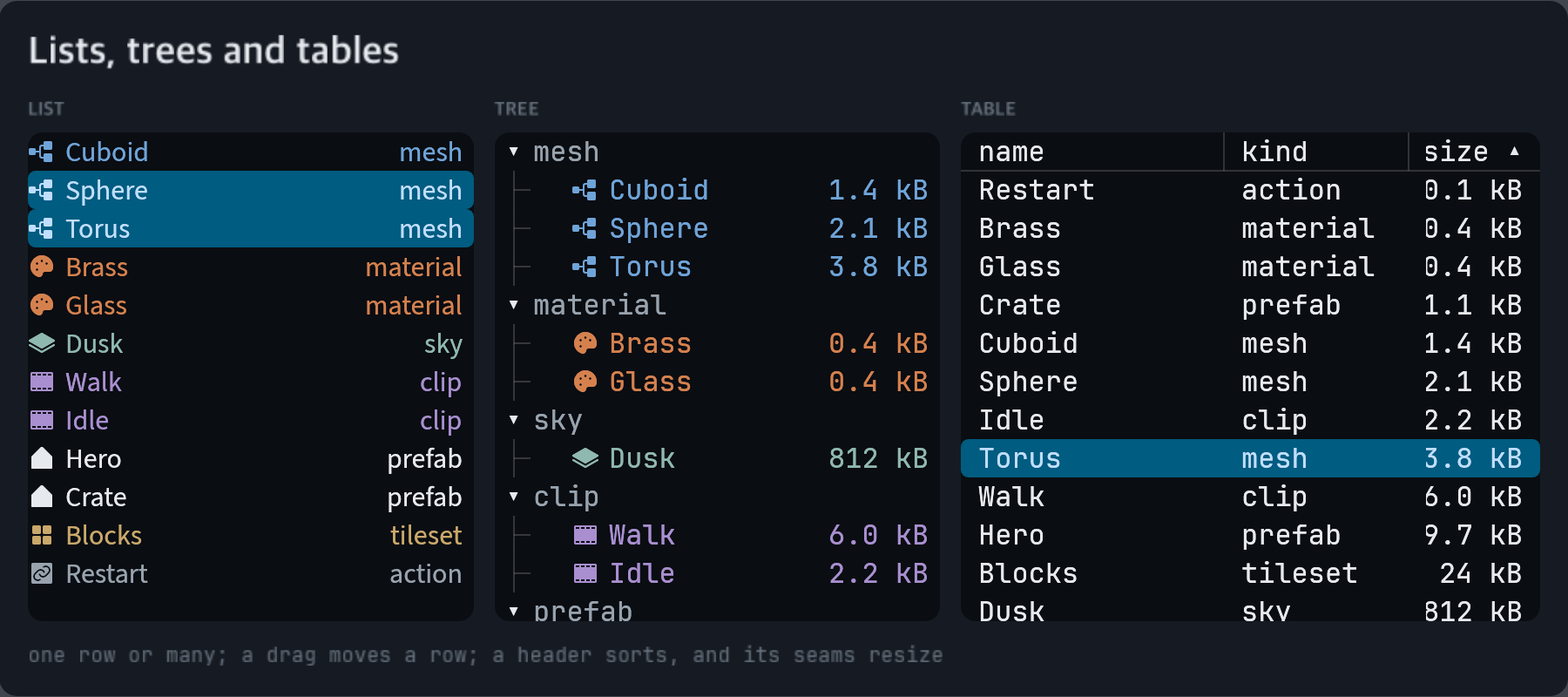
list— rows fromoptions;textis the one picked. A row splits on U+001F into an icon, a label, a trailing note and an#rrggbb. Withcolumnsabove one, rows flow into a grid of cards (ItemListin icon mode) androw_heightis the card's height.tree— alistwhose rows nest. One leading tab is one level. The fold caret is the kind's own.table— one row per line, one cell per column.titlesnames the columns and says how many there are; a name ending in>draws its column against the right edge. A drag on the seam in the header moves a column's width, and a row may carry an#rrggbbpast its last cell.multi_select— lets alist,treeortablehold more than one row. The platform's command key toggles a row and shift takes the run from the last one clicked.selectionis what the widget holds either way, one row or many, so nothing reading it back branches;textis the row last clicked.on_changehears the whole set where the widget holds many, and the row where it holds one.widths— a share pertablecolumn, normalised:["3", "1"]is three quarters and a quarter, and empty divides the width evenly. A drag on a seam in the header writes the shares back, so the scene keeps them.header— off, atabledraws no strip of column names. The columns are stilltitles', and a table that names none keeps its first row.sort— the column the rows are drawn in the order of;reverseturns it round, andsortablelets a click on a header ask for either and writes both back. A cell that starts with a number sorts as one, so12 KBfollows3 KB.reorderable— a drag moves a row of alistor atree. The kind draws where the row would land and callson_movewith the row moved, the row it landed on, andbefore,afterorinto. The rows themselves are the script's to reorder.code— an editor with gutter, syntax colours and caret. The same editor as theuimodule'scode_editor.draw— a rect a script fills. The node owns the placement, the script owns the contents.menu— a button that drops its child rows. A row that is itself amenuis a submenu.placementsays where it opens.toast— a message that stacks at its anchor and leaves when itsdurationis up. Atoastbinding action puts one up with no script.
Only the rows on screen are built, in all three. A long list costs its
viewport rather than its length. A secondary click picks the row it lands on,
so a context menu acts on what it opened over; a row already picked keeps
the set it is in.
Layout
A container hands its children rects.
grow— the share of leftover space this box takes along the container's direction. Zero takes only its own size.gap— space between children.paddingis space inside the container's edge.align— where children sit across the container's direction.justify— how they spread along it:start,center,end,between,aroundorevenly.width— the box, withheight,min_widthandmin_height. Zero hugs the content.handle— the grab width of the seams between children. A drag writes the new size onto the neighbour that states one.
Layout is taffy, the layout engine
Dioxus and Blitz use. It runs over the whole tree before drawing. ui::widget_rect
reads a rect back in the same frame.
Themes and roles
A widget_theme asset says how each kind looks. A widget takes the theme of
the nearest ancestor that names one.
type = "widget_theme"

[colors]
background = "#0e1116"
primary = "#6fa4d8"

[button]
fill = "bg_control"
corner_radius = "radius"
padding_x = 10

[button.hover]
fill = "primary_bg"

[roles.primary]
fill = "primary_fill"
text_color = "text_on_primary"
font_weight = 700
[colors]states the source colours:background,foreground,primary,secondary,success,warninganddanger. Every other token is derived from them, and stating one overrides its rule.darkfollows from the background. Each ink is walked toward the foreground until it reads at WCAG AA on the three surfaces text lands on.[sizes]statesfont_size,radius,control_heightandstroke_width, and the rest derive from those four. A number in any table may name a size instead.[<kind>]is that kind's look. A kind the file leaves out keeps the built-in one.[roles.<name>]is the same table under a name. A widget takes it withrole = "primary", over its kind's.hover,active,focus,disabledandcheckedtables say how it looks in each state.checkeddresses a checkbox, a switch or a toggle button that is on.- A widget's own
fill,stroke,corner_radius,text_color,font_sizeandfont_familywin over the theme. [<kind>] imagewithslicemakes the kind's background a nine-patch, on a row view as on a panel.
| Token | What it paints |
|---|---|
bg_app, bg_panel | the ground behind everything, and a sheet on it |
bg_control, bg_control_hover | a control at rest, and under the pointer |
border_default | every outline |
text_default, text_muted, text_subtle | three levels of text |
primary_fill, primary_fill_hover | a solid fill, and the same under the pointer |
primary_text, primary_bg | ink in the colour, and a tint of it behind a control that is on |
text_on_primary | ink on primary_fill |
font_size_small, font_size_large, font_size_title | from font_size |
radius_small, radius_large | from radius |
control_height_small, control_height_large, control_height_touch | from control_height |
secondary, success, warning and danger take the same five colour
tokens as primary.
A list, tree or table paints more than one plate, so the parts it draws
are [colors] of their own. Each takes the built-in look where the theme
names none, and a colour with no alpha draws nothing.
| Token | What it paints |
|---|---|
row_selected, row_selected_text | a picked row, and the ink on it |
row_hover, row_active | what a row takes under the pointer, and while it is held |
row_stripe | a table's every other row |
table_header | its header's plate |
table_rule | the lines down its columns, and the one under its header |
tree_guide | the lines down a tree's indent |
These are the rows, not the box: [list.hover] still dresses the whole view
under the pointer, the way it does any other kind. So table_rule = "#00000000" is a table with no lines, and row_stripe the same is one with
no striping. padding_x on the kind is the air either side
of a cell, and gap is the space between a list's cards.
Also on every widget: tooltip, icon (a glyph from the theme's icon
family, drawn before the caption), enabled and interactive. Both are on
unless turned off: enabled = false greys the widget out and swallows its
clicks, and interactive = false lets the pointer through to the scene.
image is the picture an image widget or a button draws, sheet the
picture a list cuts its card faces from, and language what a code
widget highlights.
Three more say what a widget answers to. context names a menu a right
click or a long press opens at the pointer. shortcut is a chord that
clicks the widget from anywhere, as cmd+shift+s or f5. selectable lets
a drag over a label select its text for the platform's copy key.
The ui module: immediate mode
pub fn draw_ui(this) {
    ui::left_panel("outline", #{ width: 260 }, || {
        ui::label("Nodes", #{ font_size: "font_size_large" });
        if ui::button("Add node", #{ role: "primary" }) {
            // ...
        }
    });
}
draw_uiruns once per frame inside the egui pass.- Panel and container calls take a closure for their children, as Rust egui code does.
- A widget that changes returns a tuple:
let (text, changed) = ui::text_field(...). - The set: panels, labels, buttons, switches, sliders, number fields,
dropdowns, text fields, dialogs, scroll areas, menus, shortcuts, and
ui::code_editor, an editable Rune-highlighted buffer. - For canvases: a timeline's lanes, a weight table, a painting tool. A
drawnode places one in a tree of widgets. ui::set_themetakes the document awidget_themefile holds, so its roles dress both kinds of UI. A call's own options win over its role.ui::complete_themeanswers the document with every token derived, andui::contrastmeasures two colours the way the theme does.- Fonts load from
<project>/fonts/*.ttf, withheading,ui,monoandiconalways available. - All dimensions are design pixels.
ui::set_scale(f)multiplies every metric and the query functions divide back. HiDPI is separate and automatic.
The editor's four painting views use this module inside draw nodes. See
The editor.
Example
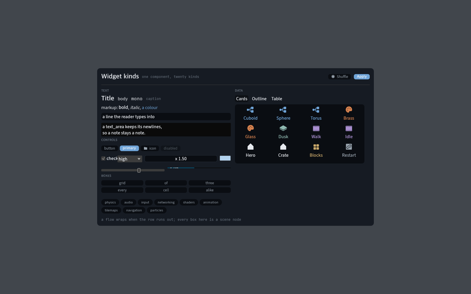
examples/interface is a whole screen built from widgets: a card grid, an
outline, a table, a row of every control, and a theme with roles and hover
states. One script fills the three views; the layout is in the scene.
Three more scenes sit beside it. scenes/rows.toml is the three row views
over one set of entries. scenes/menus.toml is a menu bar, a context menu and
a toast; scenes/text.toml is a label with links and hints, a selectable
line, and numbers with arrows and units. Open any of them with --scene.