Widgets and themes
Lists, trees, tables and a code editor are widget kinds. A theme carries roles and hover states, and taffy lays out the whole tree before a pixel is drawn.
-
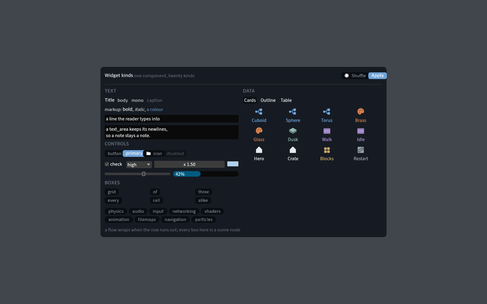
listholds rows and reports the pick; withcolumnsabove one the rows flow into a grid of cards.treenests them, one leading tab a level, andtablesplits a row into one cell a column. Only the rows on screen are built.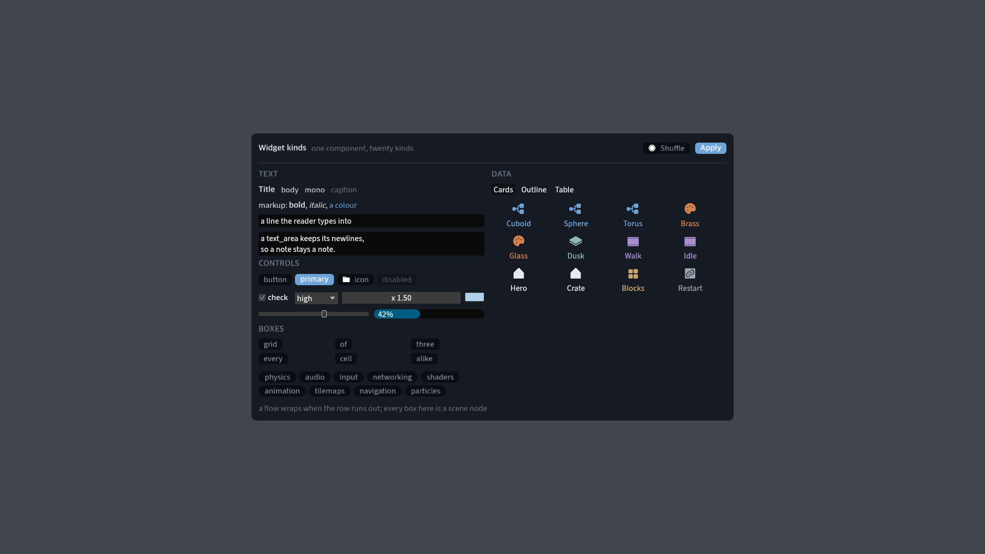
-
codeis the file being edited, with its gutter, colours and caret, as a node. -
In a theme,
[colors]names the fills,[<kind>]dresses a kind, and[roles.<name>]is a look a widget takes by name.[<kind>.hover]and[<kind>.active]say how it looks under the pointer. -
grow,gap,padding,align,justifyand the minimum sizes are taffy's flexbox. The tree is solved before drawing, andui::widget_rectreads back this frame's rect. -
The editor's shell, docks, tab rows, top bar, outliner and inspector are widget nodes in
editor/scenes/main.toml. The timeline, the weight table and two painting tools aredrawnodes.
[nodes.widget]
kind = "list"
columns = 5
row_height = 84
grow = 1
examples/interface is a screen of widget nodes; its one script fills three
views and writes no layout. The manual and the generated
component reference have the keys.