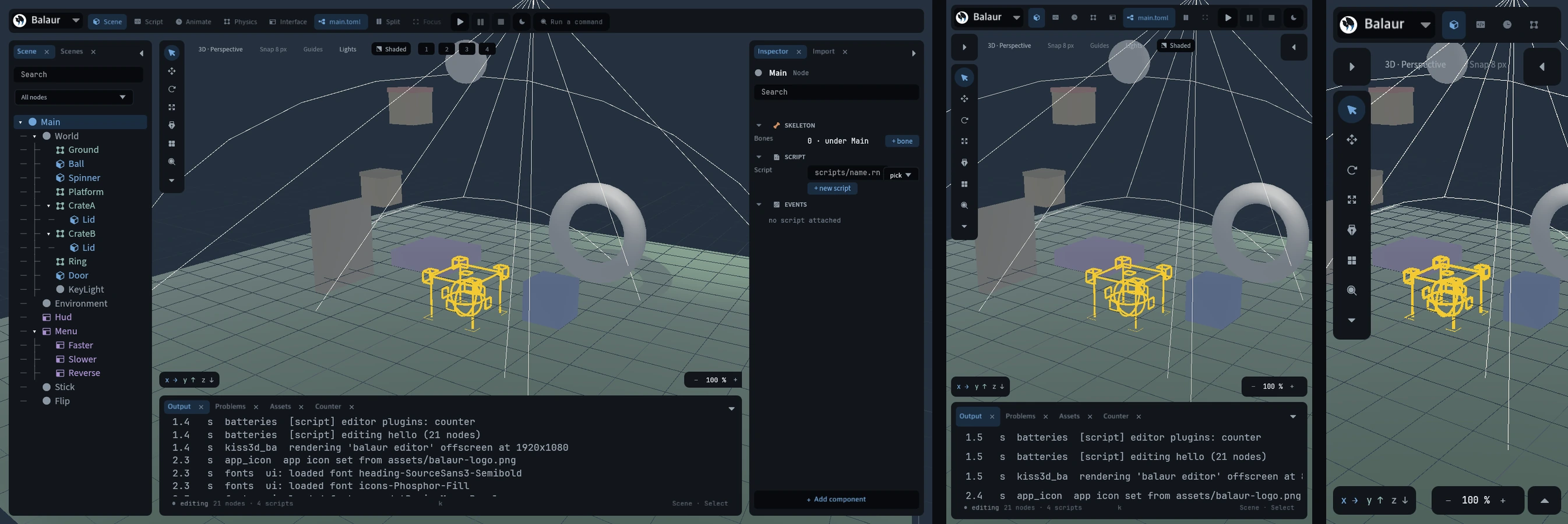
The editor on a phone
· 2 min read
The editor reads two things about the screen it gets: how much room there is, and whether a finger drives it. Everything else follows.
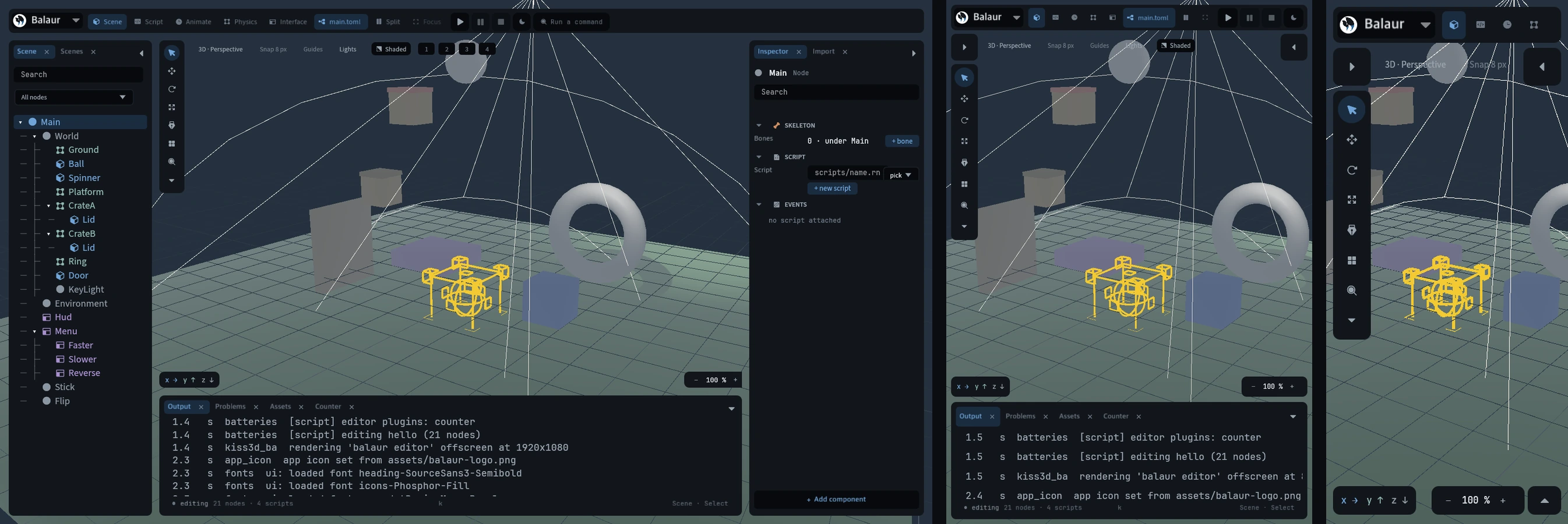
The width is read every frame, because a rotation changes it. The input class is fixed for a run and recorded, so a session captured on a phone replays as one. A scene, a theme and the shell itself can all answer to either.
What each screen gets
- Desktop is unchanged: three docks, the tool rail, the whole chrome.
- On a tablet both side docks start folded, and an unfolded one takes half the screen. The bottom dock stays, because it runs along the stage.
- On a phone all three start folded, and one opens at a time.
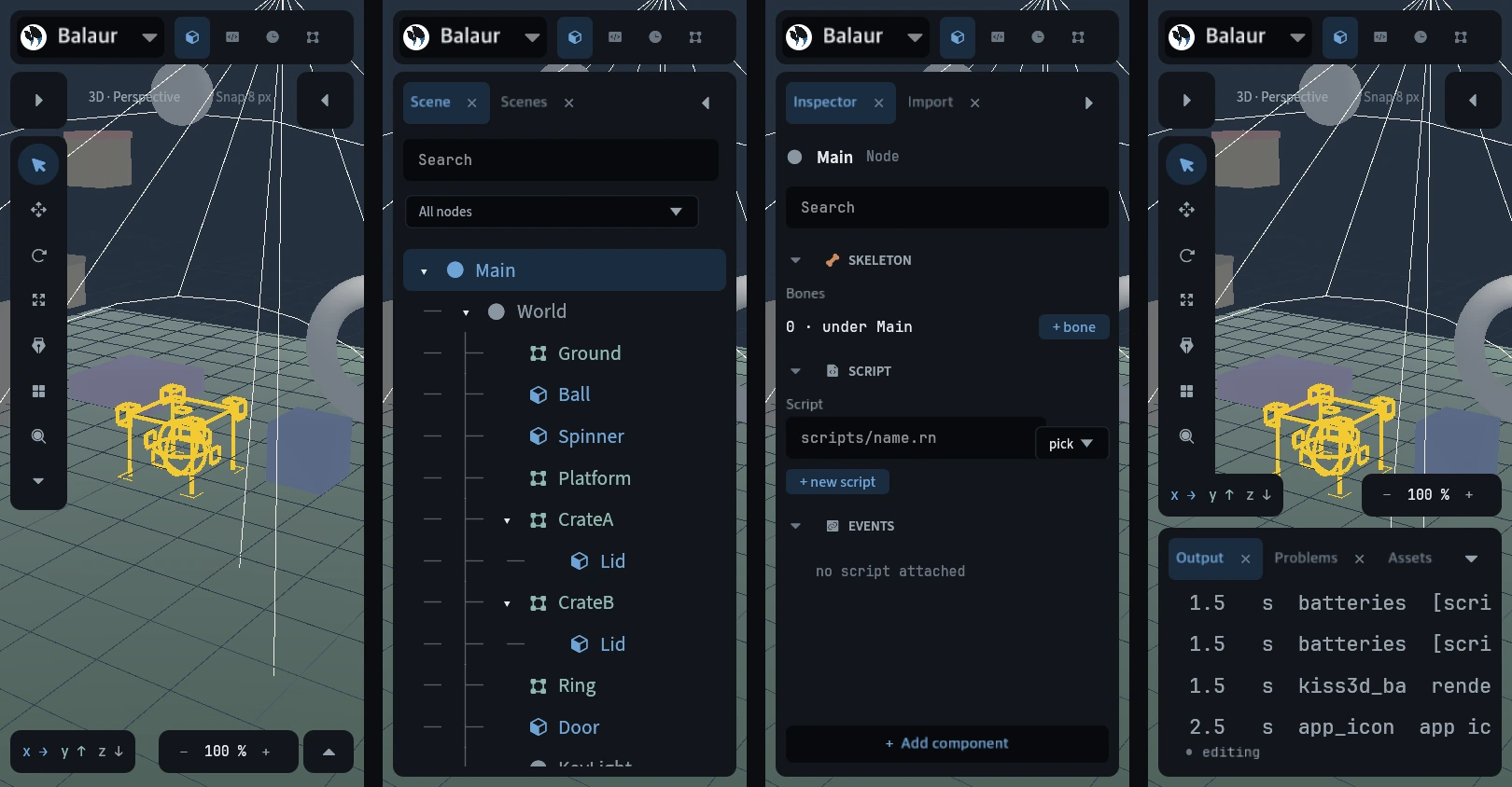
- A folded dock leaves a handle at the edge it folded to. An opened one takes the whole screen, and its own fold is the way back.
- What does not fit goes. The rail and the viewport's chips show where their minimum fits in the room the docks leave. A sheet that fills the screen takes them with it; an open bottom dock does not.
Bigger, not just taller
A 44 point floor under every control a finger reaches is not enough:
- A floor grows a box, not its contents. A 26 pixel button at 44 keeps its 14 pixel glyph, so the icon sits in a field of empty plate.
- It overflows the bar holding it. The head row is 26 tall, and its buttons would draw outside it.
- Nothing gets easier to read. Text and icons keep their sizes.
A scale grows the glyph, the plate and the bar together. So the shell draws
larger on a touch screen, and the theme states a bigger box under touch. The
editor's selftest measures the rect each control drew and fails under 44.