Editor themes
· 3 min read
The editor's look is a theme file, and the Theme window edits one while the editor wears it. A theme states a few source colours and every other token is derived from them.
Sources and tokens
- The dark theme states six colours:
background,foreground,primary,secondary,warninganddanger. The other 55 of its 61 tokens are derived. - A token is
<group>_<role>:bg_panel,text_muted,primary_fill,text_on_primary. Stating one overrides its rule. - Sizes work the same way.
font_size = 12andcontrol_height = 24give the editor's 11, 14 and 17 px text and its 20, 30 and 33 px controls. - The 106 roles live in one
roles.tomlboth bundled themes share, so the dark and light files hold colours only.
Your own themes
- Duplicate writes
themes/dark-custom.tomlin the editor's data folder, holdingbase = "dark"and nothing else. The copy is worn at once. - Save writes only the keys that differ from the base, so a theme with its own primary colour is one line.
editor/appearance/themelistsdark,lightand every file in that folder. The ☾ button writes the same setting.
The window
- It opens from the menu, from Settings, or from the palette.
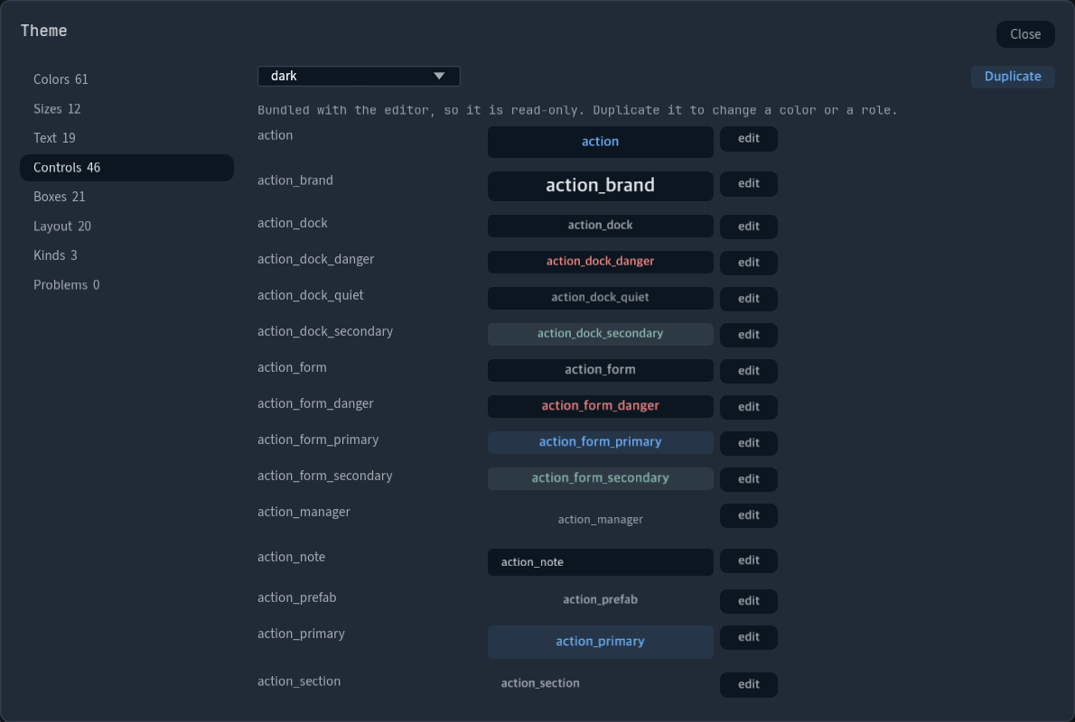
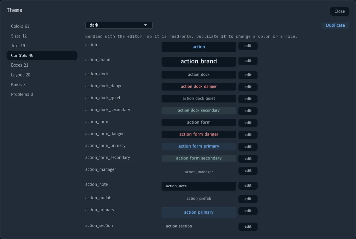
- The side lists Colors, Sizes, Text, Controls, Boxes, Layout, Kinds and Problems. A derived token reads quieter than one the theme states.
- Each role is drawn as itself. Edit lists its keys: a swatch and a token for a colour, a number or a size's name for a size.
- A chip row picks the role or its
hover,active,focus,disabled,checkedortouchtable, and "add a key…" states one the base leaves out.
Contrast
- Every role's text is measured on its fill with the WCAG 2 ratio. Problems lists each pair under 4.5:1, or 3:1 for large text. Both bundled themes have none.
ui::contrast(a, b),ui::contrast_pairs(theme, ground)andui::complete_theme(theme)give a script the same numbers and tokens.
# themes/dusk.toml
type = "widget_theme"
base = "dark"

[colors]
primary = "#c8843e"
background = "#221e28"